Chemistry and Graphing
M.
Rachel Wang
Spokane Falls Community
College
Sample Web Page from Hyperstat On-line textbook by David Malone
http://www.ksu.edu/stats/tch/malone/computers/excel/
Scatterplot
A
scatterplot is used to show the relationship between two variables. The
following steps can be used to make a scatterplot.
-
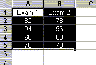
Before starting, the two
variables of interest should be next to one another (the variable for the
x-axis on the left). You can use the Copy/Paste options under Edit to do this.
See
"How do I edit my work?"
for more information.
-
Highlight the variable names and
the data values.
-
Click the
 (Chart
Wizard) button on the menu bar.
(Chart
Wizard) button on the menu bar.
-
Select XY(Scatter) under Chart
type:. You can choose a style for the scatterplot under Chart sub-type. I
usually select the box in the first row. After choosing the Chart sub-type,
click Next>.
-
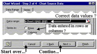
In Chart Wizard - Step 2 of 4, we
need to make sure the correct data values were highlighted. Data range:
includes the data values to be plotted. Further, if the data was enter in
columns, Columns should be selected under Series in:. Click Next > to continue
or Cancel to start over.
-
Chart Wizard - Step 3 of 4 is used
to change the appearance of the bar chart.
-
Titles Tab: add a title and axes
labels to the chart
-
Axes Tab: controls the axes style
-
Gridlines Tab: controls the
gridlines on the chart
-
Legend Tab: controls the
placement of the legend
-
Data Labels Tab: changes the
appearance of the data symbols on the chart
-
Click Next >. ChartWizard - Step 4
of 4, is used to determine the placement of the output.
-
Selecting As new sheet: will
place the scatterplot on a new sheet. Place cursor in the box and type the
name of the new sheet.
-
Selecting As object in: will
allow you to put the scatterplot into a current sheet. Use the drop-down
arrow to select the sheet.
-
Click Finish and the scatterplot
will be placed onto your spreadsheet.
Notes:
-
Changing the
scale on the
axes.
-
The plot can be moved by placing
the cursor on the plot and while holding the left mouse button down, move the
graph to the desired location.
-
You can edit your plot to make any necessary changes.
See
How do I edit my graph
for more information.